Appearance Settings
The Appearance tab is where the assistant gets its look. It's organized into five collapsible sections, from simple choices to full CSS-level control — go as shallow or as deep as you need.
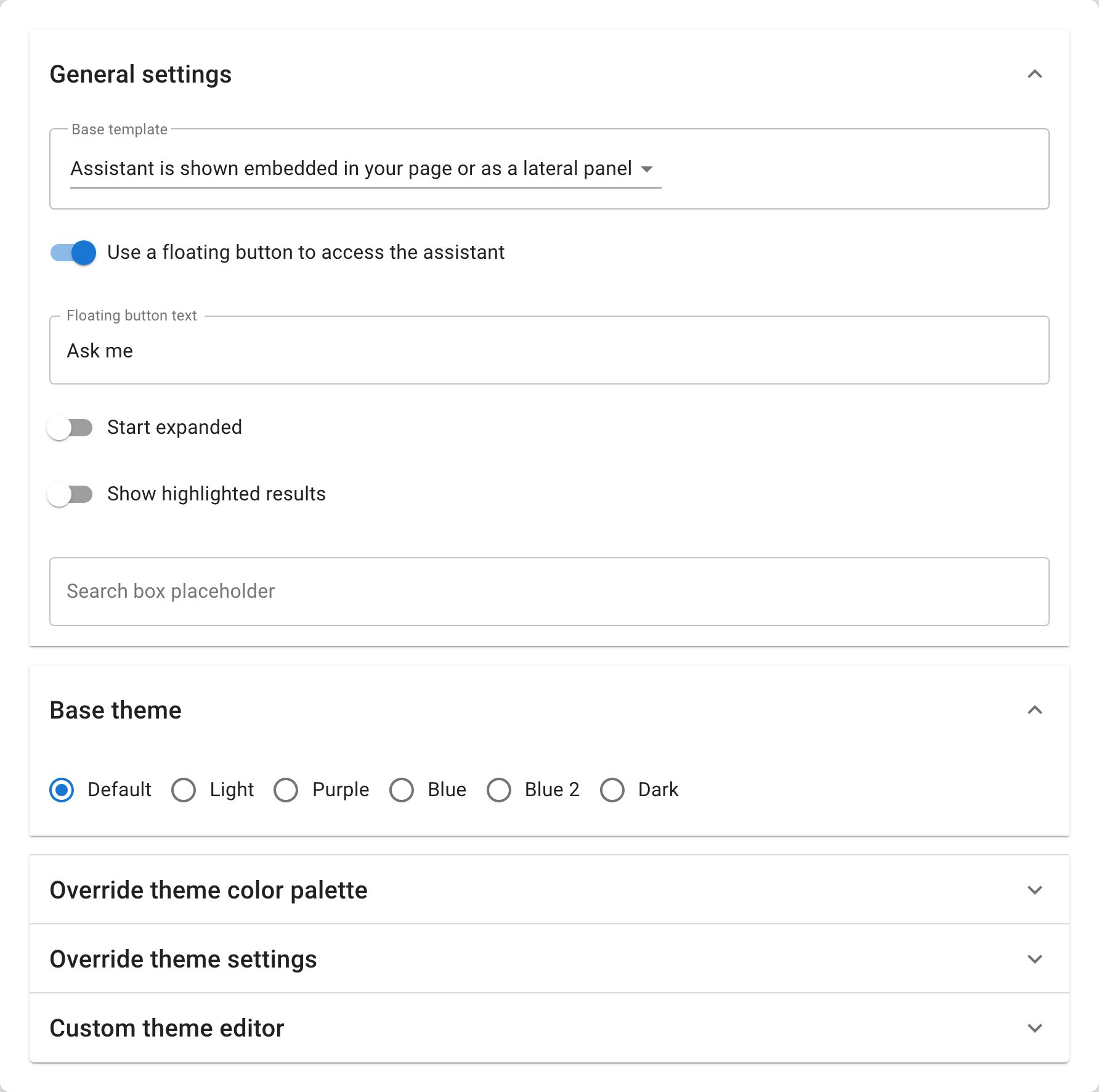
Layout and Launcher
| Setting | Default | What it does |
|---|---|---|
| Base template | default | How the assistant renders: default (embedded in the page or a side panel) or overlay (a compact, search-box style). |
| Use a floating button | off | Adds a launcher button in the corner of the page that opens the assistant in a floating window. |
| Floating button text | "Ask me" | The label on the launcher button. Keep it short and action-oriented — "Ask me", "Need help?", "Chat with us". |
| Start expanded | off | When on, the floating window opens already expanded on page load — the visitor sees the chat immediately without clicking the button. |
When to use a floating button: whenever you embed the assistant on a site with its own content and don't want the chat to compete for space. The button sits in a corner, and visitors open it when they need it.
When to embed inline: when the assistant is the content — a dedicated support page, a search portal, a help center landing.
Base Theme
The base theme is your starting point. Pick the one closest to your site's look and refine from there with the palette or the theme editor.
| Theme | What it sets |
|---|---|
| default | A neutral starting point with teal accent — works on most sites. |
| light | Light backgrounds (#F3F3F3) for messages and footer. Clean and minimal. |
| dark | Full dark-mode — dark backgrounds, light text, muted borders. Best for dashboards and dark-themed sites. |
| purple | Overrides the brand color to purple (#9c27b0). |
| blue | Overrides the brand color to blue (#1976d2). |
| otherBlue | An alternative blue (#0288d1) with a lighter tint. |
Override Theme Color Palette
The palette editor shows a color picker for every CSS color variable the assistant uses. Each picker displays the variable name (e.g. --brand) and its current hex value. You only need to set the ones you want to change — everything else keeps its base-theme value. The colors are grouped by area:
Brand and foundations — the core look: --brand (primary accent), --brand-2 (secondary), --accent, --bg-base (base background), --bg-deep, --surface, --surface-paper, --text, --text-strong, --text-muted, --link, --border, --error, --white.
Floating button and header — --floating-button-bg, --floating-button-text, --floating-button-avatar-bg, --floating-header-bg, --floating-header-text, --floating-header-title.
Footer — --footer-bg, --footer-button-text, --footer-button-hover-text, --footer-secondary-hover-text.
Search and input — --header-bg, --search-box-bg, --search-input-text, --input-bg, --input-border.
Buttons and actions — --button-primary-bg, --button-primary-hover-bg, --button-hover, --scroll-button-bg, --scroll-button-hover-bg.
Messages — --assistant-avatar-bg, --assistant-avatar-text, --assistant-response-border, --user-message-bg, --user-message-text.
Hints — --hint-text, --hint-border, --form-hint-bg, --form-hint-border.
Code and blockquote — --code-bg, --code-text, --blockquote-text, --blockquote-border, --blockquote-strong-text.
Tables — --table-head-bg.
Tabs — --tab-text, --tab-active-text, --tab-active-border.
Status and reactions — --success-bg, --success-border, --success-text, --reaction-hover-bg.
Scrollbar — --scrollbar-thumb-bg.
Modals and overlays — --modal-bg, --modal-backdrop-bg, --overlay-muted-bg, --overlay-backdrop-bg, --overlay-panel-bg, --overlay-header-text, --overlay-search-bg, --overlay-modal-bg.
Glass and glow — --glass-bg, --glass-border, --brand-glow, --accent-glow.
Palette Example
To match a brand with a blue primary on a white background, set:
--brand→#1a73e8--button-primary-bg→#1a73e8--accent→#1a73e8
To make the floating button match a dark navbar:
--floating-button-bg→#1e293b--floating-button-text→#ffffff--floating-header-bg→#1e293b--floating-header-text→#ffffff
Override Theme Settings
Below the color palette, the Override theme settings section exposes non-color variables — fonts, dimensions, borders, shadows, and effects — as text input fields grouped by category:
Typography — --font-base (primary font), --font-code (code blocks), --font-assistant (assistant responses). Enter a CSS font stack, e.g. 'Inter', sans-serif.
Layout and sizing — --floating-bottom-offset, --floating-right-offset (floating button position), --container-width, --container-height (assistant container dimensions).
Borders and outlines — --card-border-style, --article-table-border, --modal-header-border, --overlay-panel-border, --overlay-search-border, --loading-spinner-border.
Shadows and depth — --shadow-soft, --shadow-raised, --shadow-light, --shadow-subtle, --shadow-minimal, --shadow-elevated, --shadow-premium, --floating-button-shadow, --floating-button-hover-shadow, --overlay-panel-shadow.
Gradients and effects — --brand-gradient-line, --brand-halo-welcome, --skeleton-shimmer, --glass-shimmer, --glass-blur.
Settings Example
To use a custom font and reposition the floating button:
--font-base→'Inter', sans-serif--font-assistant→'Inter', sans-serif--floating-bottom-offset→24px--floating-right-offset→24px
To soften the shadows:
--shadow-soft→0 2px 8px rgba(0,0,0,0.06)--shadow-raised→0 4px 16px rgba(0,0,0,0.08)
Custom Theme Editor
For full CSS-level control, the Custom theme editor at the bottom of the Appearance tab opens a Monaco code editor where you write a theme object in JSON that is deep-merged on top of everything else. This is where you target specific components by their CSS selectors, add responsive rules, or override any style property.
Loading the Defaults
Click Load default theme definition to populate the editor with the current computed theme — the result of your base theme + palette + settings, fully expanded. This gives you a working starting point: find the property you want to change, edit its value, and save. You never have to write a theme from scratch.
Structure
The theme object uses CSS-in-JS syntax (camelCase properties) and targets the assistant's components by their CSS selectors:
{
  ":root": {
    "--brand": "#1a73e8",
    "--text": "#1e293b"
  },
  ".skdwn-assistant-response": {
    "backgroundColor": "#f8fafc",
    "borderRadius": "12px",
    "padding": "16px"
  },
  "#skdwn-floating-button": {
    "boxShadow": "0 4px 12px rgba(0,0,0,0.15)"
  },
  "@media (max-width: 600px)": {
    "#skdwn-main-container": {
      "fontSize": "14px"
    }
  }
}
What You Can Target
| Area | Example selectors | Use it for |
|---|---|---|
| CSS variables | :root | Any variable — colors, fonts, shadows, dimensions. |
| Layout | #skdwn-main-container, #skdwn-floating-window-main | Container dimensions, positioning, borders. |
| Floating button | #skdwn-floating-button | Button size, shadow, border radius, position. |
| Messages | .skdwn-assistant-response, .skdwn-user-request | Bubble styling, padding, borders, typography. |
| Search input | .skdwn-search-input | Input styling, placeholder appearance. |
| Hints | .skdwn-hint-card | Suggested-question card styling. |
| References | .skdwn-article | Reference card layout and styling. |
| Forms | .skdwn-form-card, .skdwn-input, .skdwn-textarea | Lead-capture form styling. |
| Modals | .skdwn-modal-* | Image preview and overlay modals. |
| Overlay mode | .skdwn-overlay-* | Overlay-specific panel, search, and backdrop. |
| Responsive | @media (max-width: 600px) | Mobile-specific overrides. |
Example: Rounded Bubbles with a Custom Font
{
  ":root": {
    "--font-base": "'Inter', sans-serif",
    "--font-assistant": "'Inter', sans-serif"
  },
  ".skdwn-assistant-response": {
    "borderRadius": "16px"
  },
  ".skdwn-user-request": {
    "borderRadius": "16px"
  }
}
Example: Circular Floating Button
{
  "#skdwn-floating-button": {
    "borderRadius": "50%",
    "width": "56px",
    "height": "56px"
  }
}
How the Four Layers Merge
The assistant builds its final look by merging four layers in order — each one overrides the previous:
- Base theme — the preset you pick (default, light, dark, purple, blue, otherBlue).
- Color palette — the color pickers. These override colors from the base theme.
- Theme settings — the text fields for fonts, shadows, borders, and dimensions.
- Custom theme JSON — the code editor. This deep-merges on top of everything, so it has the final word.
Most assistants only need a base theme and a few palette colors. The theme settings are for adjusting fonts and spacing without writing JSON. The custom theme editor is for full CSS-level control over specific components.
Troubleshooting
- If text is hard to read, push up the contrast between text and background colors in the palette.
- If the widget feels too big or too small, try switching the base template (default vs. overlay) or adjust
--container-widthand--container-heightin theme settings. - Colors are applied immediately in the embedded preview — use it to iterate quickly.
- If the custom theme JSON shows errors, check for trailing commas, missing quotes, or mismatched braces. Use Load default theme definition to start from a valid object.
- CamelCase is required for CSS properties in the custom theme editor (
backgroundColor, notbackground-color), but CSS variable names keep their dashes (--brand,--text).