Display Modes
The combination of base template and floating button in Appearance settings gives you three ways to show the assistant. Pick the one that fits where and how visitors will use it.
Floating Button
Settings: base template = default, floating button = on.
A launcher button sits in the corner of the page. Visitors click it to open a chat window that floats over the page content — the page stays usable behind it.
- Start expanded off (the default) — the page loads with just the button
visible. Visitors open the chat when they choose to.
- Start expanded on — the chat window opens automatically on page load, so
visitors see the assistant immediately. Good for support pages where you want to invite questions right away.
The chat window can be maximized (full viewport), minimized (collapsed panel), or closed (back to the button). Visitors toggle between states with the window controls.
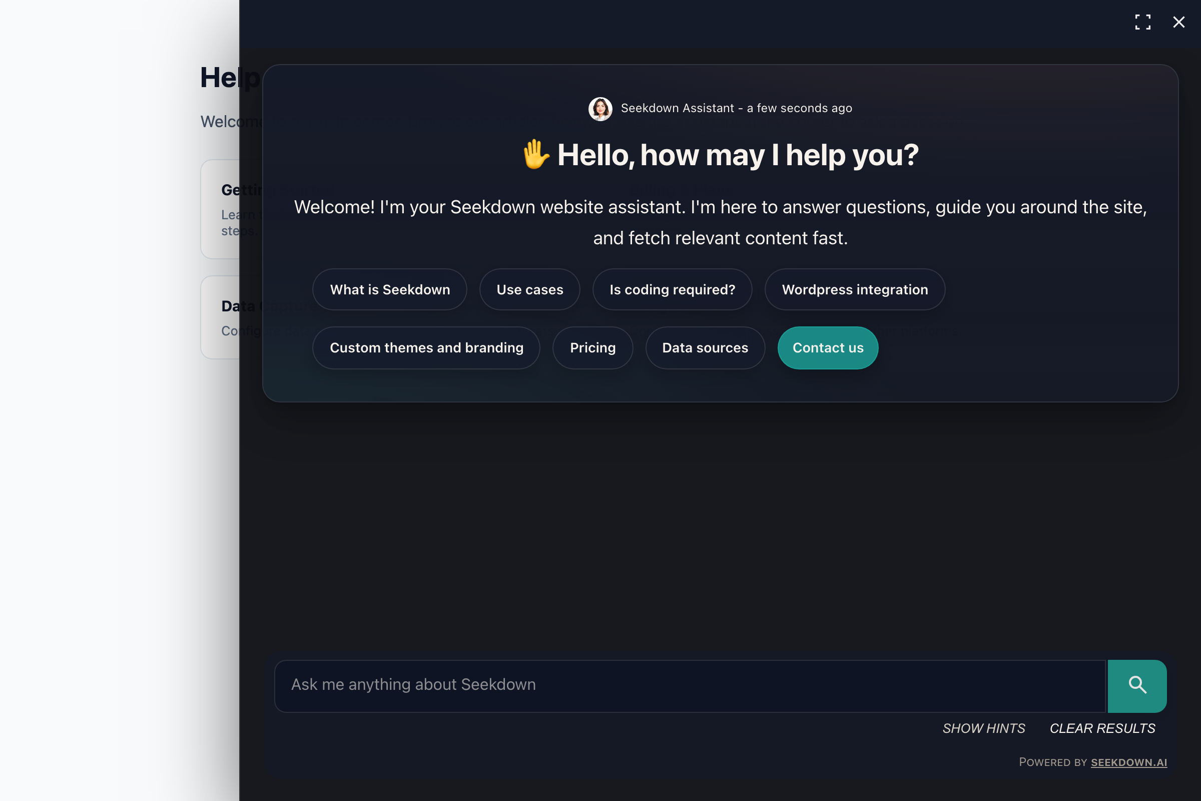
Best for: sites with their own content where the assistant is a secondary tool — product pages, documentation sites, e-commerce stores.
Embedded Inline
Settings: base template = default, floating button = off.
The assistant renders directly inside the page as a box, taking up space in the layout like any other element. It fills its container — typically a <div> you size with CSS — and the full conversation is always visible.
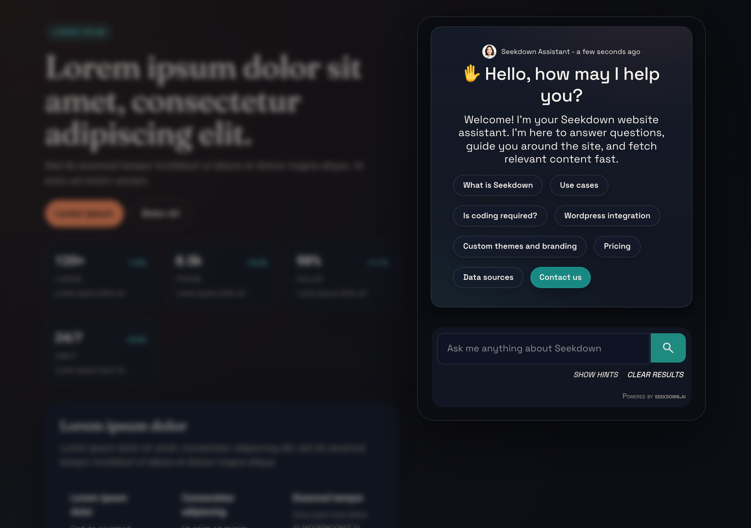
Best for: pages where the assistant is the content — a dedicated help center, a search portal, an internal knowledge base landing page.
Overlay (Search Mode)
Settings: base template = overlay, floating button = off.
The assistant appears as a compact search input embedded in the page. When a visitor clicks it or starts typing, a modal overlay opens with the full assistant interface — search bar, response, and source cards. Closing the modal returns to the page.
Unlike the default template, the overlay shows only the latest response, not the full conversation history. This keeps it fast and focused — one question, one answer.
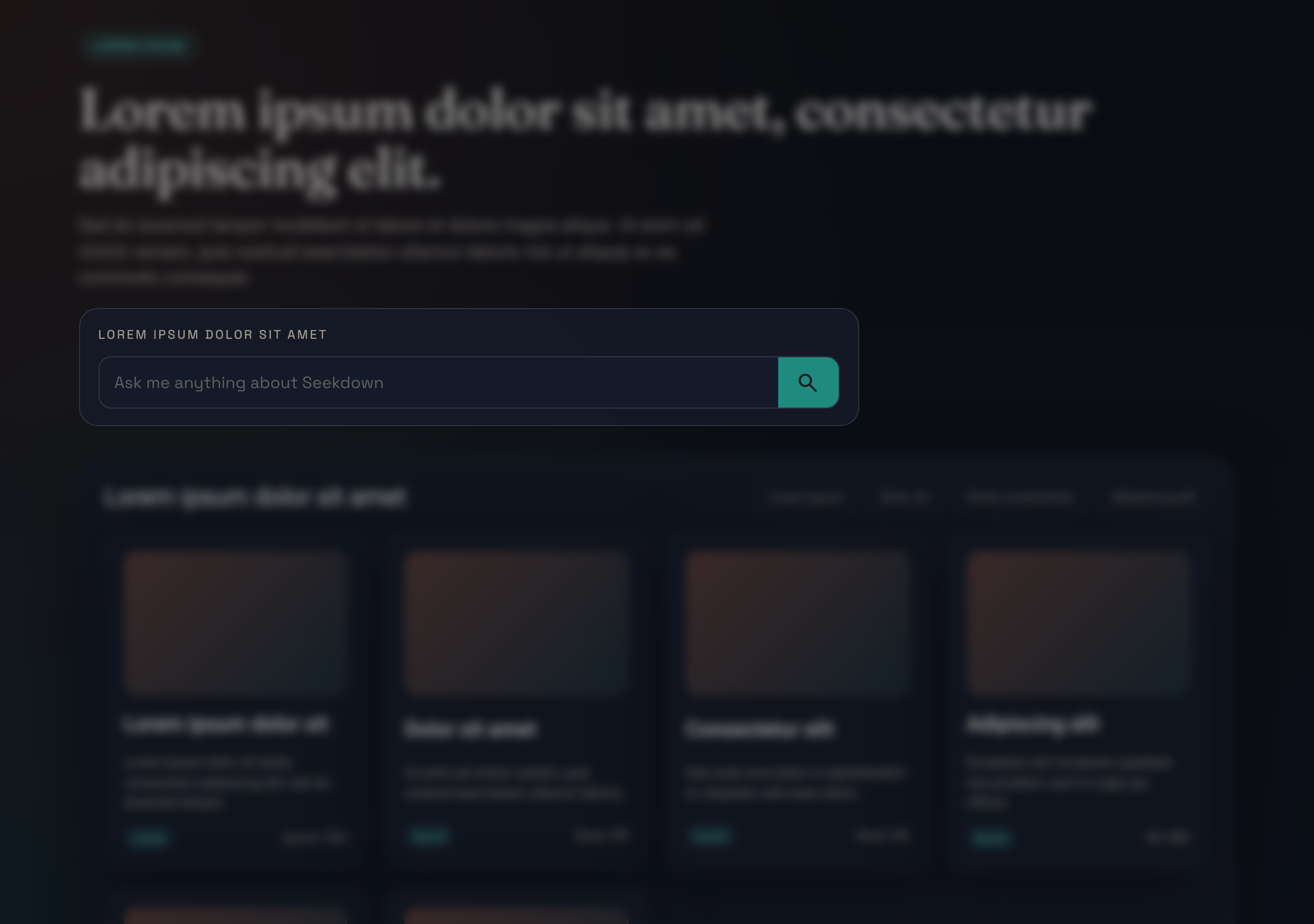
When a visitor clicks the input or starts typing, the modal opens with the full assistant interface:
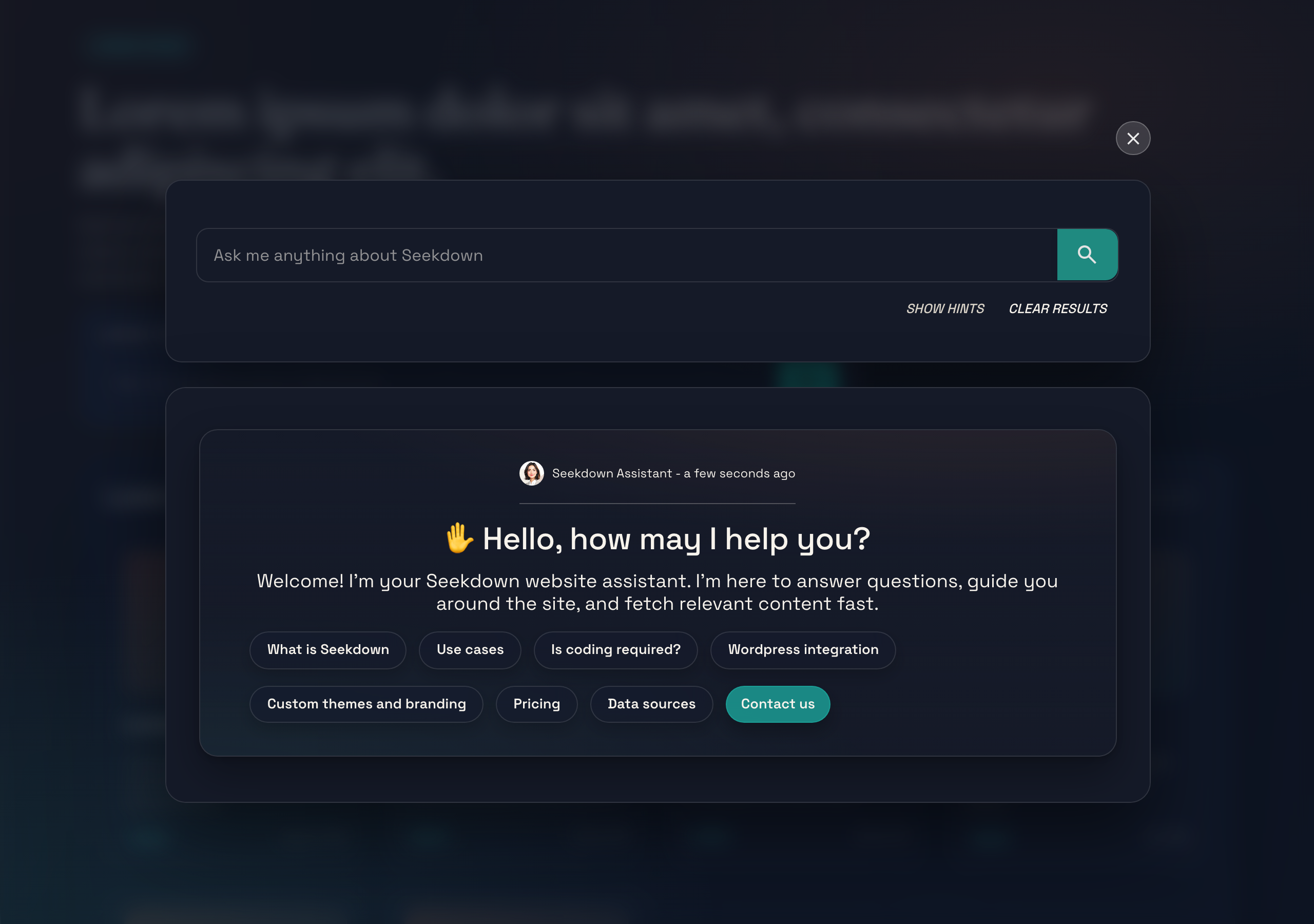
Best for: sites that already have a search box and want to replace or complement it with the assistant — documentation sites, help centers, FAQ pages, blogs.
Choosing the Right Mode
| Scenario | Mode | Why |
|---|---|---|
| Product page with support chat | Floating button | Stays out of the way, visitors open it when they need help. |
| Dedicated help center page | Embedded inline | The assistant is the whole page. |
| Documentation site search bar | Overlay | Familiar search UX — click, ask, get an answer, close. |
| Internal knowledge base | Embedded inline | Always visible for quick lookups. |
| E-commerce store | Floating button (start expanded) | Greets visitors proactively to reduce bounce. |